
CloudFire Brand Kit
This section brings together all the resources, guidelines, visual elements, and core principles needed to create consistent materials and communicate our brand correctly.
Here you will find practical guidance on how to use the logo, its variations, colors, and official assets, along with the rules to follow in order to maintain recognizability, readability, and consistency across every application. The goal is to provide a clear reference for designing content, digital materials, and communication tools that represent CloudFire in a consistent and professional way.
Logo
Il logo CloudFire è composto da una serie di rombi che richiamano uno stack di layer interconnessi. È il simbolo dell'architettura modulare e delle competenze tecniche che mettiamo a disposizione dei nostri clienti e che riflette visivamente la identità di CloudFire: una piattaforma dove tecnologie e know-how si sovrappongono per creare valore. Questa struttura rappresenta la scalabilità fluida del ecosistema CloudFire ed è utilizzata per favorire e promuovere il riconoscimento e l'identità pubblica del brand stesso.
Download logo resources from the section Logo assets download


Construction
The CloudFire logo is composed of two inseparable elements: the Logomark And the logo. It uses the logo mainly in its complete form, consisting of a logomark and a logo, always keeping the proportions identical to the original.
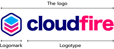
Variation in color
The CloudFire logo includes three primary color variations and three secondary color variations. Each version is designed to ensure the best possible contrast, readability, and brand consistency across different background colors and tones.
Always use the primary variations whenever they provide a minimum recommended contrast ratio of 3:1 against the background. When this contrast cannot be achieved, use the most appropriate secondary variation to preserve visibility and accessibility.
Primario
The colored version is the primary version of the CloudFire logo. It should be used on all light backgrounds, provided that sufficient contrast and accessibility are maintained.
As a recommendation, check that the logo reaches at least a 3:1 contrast ratio against the background.
Primario
The light duotone version is the primary option for dark backgrounds. It should be used on backgrounds without mid-tones, such as neutral grays, to ensure good readability, especially in the transparent areas of the logo.
Check that the dark areas of the logo maintain at least a 3:1 contrast ratio against the background.
Primario
The dark duotone version is intended for light backgrounds where the colored version does not provide enough contrast, such as pink, magenta, purple, or light blue backgrounds. The same considerations regarding mid-tones also apply to this version.
Check that the lighter parts of the logo maintain at least a 3:1 contrast ratio against the background.

Secondario
The colored reverse version is an alternative option for dark backgrounds that provide strong contrast with the logo colors.
Use this version only when the colored elements remain clearly visible and reach a recommended minimum contrast ratio of 3:1.

Secondario
The light solid version should be used on dark backgrounds with mid-tones, such as gray-toned backgrounds, where the duotone version may lose readability.
This version is recommended when the solid shape provides a clearer contrast, ideally reaching at least 3:1 against the background.

Secondario
The dark solid version should be used on light backgrounds where the colored version does not provide enough contrast, such as pink, magenta, purple, or light blue backgrounds, especially when mid-tones of these colors are present.
Use this version when it provides a clearer and more stable contrast, with a recommended minimum ratio of 3:1.
Vertical layout
The CloudFire logo is also available in a vertical layout. This version should only be used when limited space makes the horizontal layout unsuitable. Whenever possible, the horizontal version should remain the preferred choice.






Logomark
The CloudFire logomark may be used on its own only when limited space or format restrictions make the full logo unsuitable. Typical uses include website favicons, app icons, and social media avatars. The full logo should always remain the preferred option whenever space allows.


Readability
To ensure proper visibility and recognition, the CloudFire logo must always be used with adequate clear space and at an appropriate minimum size.
Clear space
A proportional grid based on the logo structure is used to define the minimum clear space required around the logo. This space helps protect the logo from visual interference caused by text, images, or other graphic elements.
- For the full logo, the minimum clear space corresponds to 1/3 of its height.
- For the logomark, the minimum clear space corresponds to 1/5 of its height.
- For the full logo, the minimum clear space corresponds to 1/3 of its height.


Minimum size
To preserve readability and visual clarity, the logo should not be used below the recommended minimum size.
The minimum height is 24 px for digital applications and 5 mm for print applications.

Rules
Our logo was carefully constructed, so please note the following brand guidelines in order to use it correctly. Some common errors that could occur when using the logo are as follows.
Do
Use the logo in the right proportions, with horizontal placement. Vertical placement is permitted in specific cases.
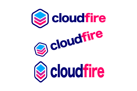
Don't
Do not alter the size, rotate, readjust, stretch or squash the logo.
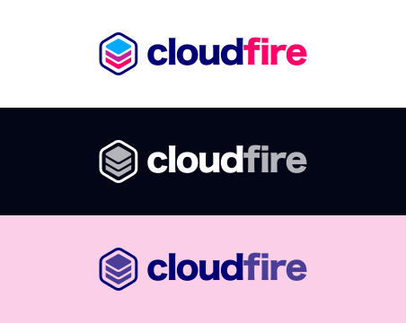
Do
Use the logo as is in the official color guidelines.
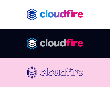
Don't
Do not outline the logo or change the colors.
Do
Use the logo as it is in plain colors without adding any effects.
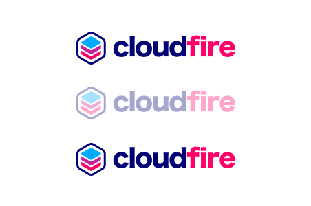
Don't
Do not add effects or transparency on the logo.
Logo assets download
Download the complete package that includes all approved versions, color variations, and layouts of the CloudFire logo for digital use and printing. The package includes the logo in vector (SVG) and raster (PNG) formats.
Colors
The CloudFire logo colors help strengthen brand recognition across every visual application. Each color should be used consistently, maintaining the right balance between identity, readability, and accessibility.
HEX
#000074
CMYK
C100 M100 Y0 K55
HEX
#FF0068
CMYK
C0 M100 Y59 K0
HEX
#00AAFF
CMYK
C100 M33 Y0 K0
HEX
#C3229C
CMYK
C0 M83 Y20 K24
The CMYK values shown above are approximate conversions from the digital HEX colors. For print applications, colors may vary depending on the printing process, paper type, ink, and color profile. Always perform a print proof and adjust the CMYK values according to the selected print profile and production requirements.